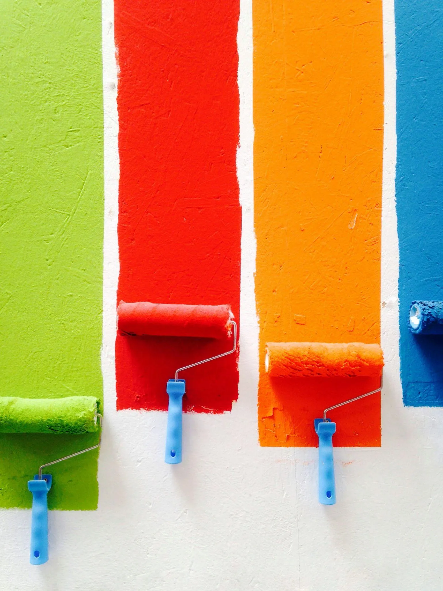
 Color Theory in Web Design – image 1″ />
How to Use Color Theory in Web Design
Color is a powerful tool in web design, one that can evoke emotions, draw attention, and create a memorable experience for your target audience. Understanding the basics of color theory can help you make informed color choices that not only look good but also enhance the user experience. In this blog, we’ll explore how to use color theory effectively in web design, including the concepts of RGB (Red, Green, Blue), the color wheel, and harmonious color combinations.
Understanding the Basics of Color Theory
Before diving into specific color combinations, it’s essential to understand the basics of color theory. At its core, color theory is a set of guidelines that helps designers choose colors that work well together. The primary colors—red, green, and blue (RGB)—are the foundation of the color wheel, which also includes secondary and tertiary colors.
- Primary Colors: These are the base colors—red, green, and blue—from which all other colors are created. In digital design, these colors are often referred to as RGB (Red, Green, Blue).
- Secondary Colors: These are created by mixing two primary colors. For example, mixing red and blue creates purple, while mixing blue and green produces cyan.
- Tertiary Colors: These colors are made by mixing a primary color with a secondary color. For example, mixing blue with green gives you teal, while mixing red with orange gives you red-orange.
Understanding these basics will help you navigate the color wheel and make better color choices in your designs.
The Color Wheel: Your Guide to Harmonious Color Combinations
The color wheel is an essential tool in web design. It visually represents the relationships between colors, allowing you to create harmonious color combinations that are pleasing to the eye.
- Analogous Colors: These are colors that are next to each other on the color wheel, such as blue, blue-green, and green. Analogous color schemes create a sense of harmony and are often found in nature, making them perfect for designs that aim to be calm and soothing.
- Complementary Colors: These colors are opposite each other on the color wheel, like red and green or blue and orange. Complementary color schemes create high contrast and are effective for designs that need to draw attention or highlight important elements.
- Split Complementary: This is a variation of the complementary color scheme. It involves one base color and two adjacent tertiary colors. For example, if your base color is blue, the split complementary colors would be red-orange and yellow-orange. This scheme provides contrast while reducing the tension of a standard complementary color scheme.
By using the color wheel as your guide, you can create a color palette that not only looks great but also supports the goals of your website.
Choosing Color for Your Target Audience
When choosing colors for your website, it’s important to consider your target audience. Different colors evoke different emotions and can influence how your audience perceives your brand.
- Red: Often associated with passion, excitement, and urgency. It’s a great color for calls to action but should be used sparingly as it can be overwhelming.
- Blue: Evokes feelings of trust, calmness, and professionalism. It’s a popular choice for corporate websites and brands that want to convey reliability.
- Green: Symbolizes growth, health, and tranquility. Green is often used for eco-friendly brands or those that want to promote well-being.
- Neutral Colors: Colors like white, gray, and beige are often used as background colors to balance out brighter colors. They help create a clean, modern look and can make your content stand out.
Understanding your audience’s preferences and the emotions that different colors evoke will help you make better color choices in your web design.
Creating a Sense of Balance with Neutral Colors
Neutral colors play a crucial role in web design. They serve as a backdrop, allowing other colors to stand out without overwhelming the viewer. When used effectively, neutral colors can create a sense of balance and make your website more visually appealing.
- White: Often used as a background color, white creates a sense of space and simplicity. It’s a popular choice for websites that want to convey cleanliness and modernity.
- Gray: A versatile color that can be used in various shades to create depth and sophistication. It’s often used in combination with brighter colors to create a balanced design.
- Beige: A warm, neutral color that can create a welcoming and relaxed atmosphere. It’s a great choice for websites that want to feel approachable and friendly.
By incorporating neutral colors into your design, you can create a sense of harmony and ensure that your content remains the focal point.
Drawing Attention with High Contrast Colors
One of the most effective ways to draw attention to important elements on your website is by using high-contrast colors. High contrast is achieved by pairing colors that are opposite each other on the color wheel, such as black and white or red and green.
- Call to Action (CTA) Buttons: High-contrast colors are often used for CTA buttons to make them stand out. For example, a bright red button on a white background is hard to miss and encourages users to take action.
- Headlines: Using a contrasting color for headlines can help them stand out from the rest of the text, making it easier for users to scan your website and find the information they’re looking for.
- Important Information: If you want to highlight critical information, such as a sale or special offer, using high-contrast colors will ensure it doesn’t go unnoticed.
By strategically using high-contrast colors, you can guide your users’ attention to the most important elements of your website.

Creating a Cohesive Look with a Color Palette
A well-designed color palette is essential for creating a cohesive look and feel for your website. A color palette typically consists of a few primary colors, secondary colors, and neutral colors that work well together.
- Harmonious Color Combinations: Choose colors that complement each other and create a sense of harmony. For example, if you’re using a blue and green color scheme, consider adding a neutral color like white or gray to balance it out.
- Consistent Use: Once you’ve established your color palette, use it consistently throughout your website. This includes your background colors, text colors, and accents. Consistency helps reinforce your brand identity and creates a professional appearance.
- Customizing for Your Brand: Your color palette should reflect your brand’s personality. If your brand is bold and energetic, opt for vibrant colors. If your brand is more conservative, stick to a more muted color scheme.
By creating a cohesive color palette, you can ensure that your website looks polished and professional.
Going Beyond the Basics: Experimenting with Color
While it’s crucial to understand the basics of color theory, don’t be afraid to experiment and push the boundaries of traditional color schemes. Sometimes, the most memorable designs come from unexpected color combinations that challenge the norms. For example, mixing a monochromatic scheme with a pop of a complementary color can create a striking visual effect that sets your brand apart. Just remember to keep your target audience in mind and ensure that any bold color choices still align with your brand’s message and goals.
Conclusion: The Power of Color in Web Design
Color is a powerful tool in web design that can influence how users perceive your website and interact with your content. By understanding the basics of color theory, using the color wheel to create harmonious combinations, and making informed color choices for your target audience, you can create a website that is not only visually appealing but also effective in achieving your goals. Whether you’re using neutral colors to create balance or high-contrast colors to draw attention, the right color choices can make all the difference in your web design. And as you gain confidence in using color, don’t hesitate to explore and experiment with different combinations to truly make your website stand out.
Ready to elevate your online presence? Contact OCImagine for a free consultation. We offer web design, app development, ecommerce solutions, and AI automation for businesses in Orange County and beyond.